Make Your Own Clip Art Using Photos and Picnik

July 19th, 2008 WordPlay Posted in Blogging, Cartoons, Clip Art, Entertainment, Free Clip Art, Free Graphics, Free Images, Free Online Tools, Free Photos, Just For Fun, Make Your Own Clip Art, Photography, Reviews, Tips and Tools 7 Comments »

focal-soften-shapes-pencil-sketch-duotone If you aspire to create your own clip art, you’re not limited to just using graphic elements. As you can see in the gallery below, you also can alter photos to achieve a variety of effects. Don’t know how to use Illustrator or Photoshop? Don’t worry; you don’t need to. You can use the free online Web application Picnik and still achieve professional results.

If you’re unfamiliar with Picnik, you might want to read the previous post detailing how it can help you make your own clip art. In this post, I’m only going to cover how to alter photos. Some of the methods that apply to making clip art from scratch are used with photos, too, so I’ll link to the other tutorial from the word Shapes any time it’s applicable.

1. To begin, you’ll need a photo. If you don’t have any in your personal collection, I suggest downloading one from Stock.Xchng. (See WordPlay’s Stock.Xchng review for the very liberal parameters flower-posterizesurrounding using photos from their site.) Most of the photos below came from StockXchng, and as you can see, the quality is excellent.

Even if you don’t have a great photo to start with, the good thing about using Picnik for making clip art is that you could even turn a bad photo into something beautiful. Another great Picnik feature is that if you’re a Firefox or Internet Explorer user, you can just right-click any photo you find and have it open in Picnik. (Click here for more information.) If you use Stock.Xchng to get your photos, though, I recommend also saving a copy of the photo to your hard drive with its original name. This will allow you to go back to Stock.Xchng later, enter the photo name into the search bar and find the photographer. You can then leave a comment in the photographer’s Comments box with a link to the photo’s location. Not only is this the right thing to do, but some Stock.Xchng photographers make it mandatory if you use their images. But there’s a benefit to you too. Each time you leave a link in a comment, you get a link back to you from Stock.Xchng.

2. Once you have your photo, either right-click and choose the option to edit it in Picnik go to Picnik.com and click the Get started now! button, and then the Upload Photo button. (If you decide you don’t want to use that photo at any time, click the Home navigation tab and you’ll be given the option to delete that photo and upload another.) The photo will automatically open into the Edit screen. Unless you need to make adjustments to your photo (crop, resize, fix red-eye or other edits), click the Create navigation tab.

Picnik_effects3. Once in the Create area, the three tabs you’ll use to create the effects shown below will be Effects, Text and Shapes. I went over Text and Shapes in my previous tutorial, but many of the looks below will also require the use of the Effects menu. Fortunately, Picnik has marked each effect clearly, so it’s easy to choose the one you want. If I’m undecided, I often “audition” each effect on a photo until I see something I like. You can find some surprising and wonderful new looks this way. You also can combine effects by saving each one and layering others on top, and making adjustments to each look by using the features within each effect. If you ever don’t like the look you get from Effects or any other Picnik feature, just click the Undo button at the top right of the page to remove it.

4. Once you get the basics of using Effects, I suggest playing with them to become more familiar. There are myriad ways each can be manipulated, which leaves endless possibilities for being creative once you’ve gotten the hang of it.

Visit Picnik

Here are the images I created with Picnik:

Click any of the photos below to see a larger version.

Original Photo Photo Altered with Picnik
1024270_children_of_africa focal-soften-tint
This photo was altered by using Focal Soften + Tint.
Photo by Sias van Schalkwyk
_
1031997_cowboy_sunset cowboy-sunset-create-shapes
This photo incorporates a variety of Shapes (bursts and lightning bolts around the edges with vines layered on top and an eagle in the center).
Photo by Vector Dapner
Schloss_3 lake-heat-map
This photo was altered using Shapes (clouds and eagle) + Heat Map
Photo by Dave Schloss
_
Clark Gable Clark Gable
This photo was altered using Shapes (vines and thought bubble) + Text.
Photo from the public domain
_
1028940_guitar_hero_d boost-HDR
This photo was altered using Boost + HDR-ish.
Photo by rubinho 1
_
1031841_bright_pink_flower_2 focal-soften-shapes-pencil-sketch-duotone
This photo was altered using Focal Soften + Pencil Sketch + Duo-Tone + Shapes (chunks of squares)

Photo by Taryn Kaiser

1036399_strawberries_1 strawberry-create-shapes
This photo was altered using Shapes (sourpuss face line drawing)
Photo by Ove Tøpfer
_
See more clip art made with Picnik:
_
General
Gothic Fantasy Clip Art
Animal Clip Art
Flower Clip Art
Engagement, Bridal Shower and Wedding Clip Art
_
Seasonal
Summer Clip Art
Election Clip Art
Inauguration Clip Art
Holidays
Black and White Halloween Clip Art
Halloween Pumpkin Clip Art
Halloween Masks
Fourth of July Clip Art
Thanksgiving Clip Art
_
Don’t want to spend the time to make your own clip art? Try WordPlay’s collection of quality free clip art sources. Or visit Avatar Central, which lists all our image resources.
_

Zemanta Delivers Free Graphics, Keywords and More to Your Browser

March 29th, 2008 WordPlay Posted in Blogging, Free Graphics, Free Images, Free Online Tools, Free Photos, Free Software, Reviews, Tips and Tools, Writing Tips and Tools 6 Comments »

Zemanta Gallery
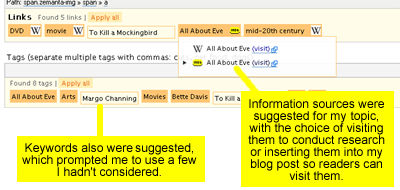
I recently read about Zemanta’s ability to deliver free graphics and other resources right to your browser and thought, yeah, that might be cool. But then I saw it in action and I truly got excited.

For those who haven’t heard about it, Zemanta is a plugin for Mozilla Firefox 2 and 3 that can be used with WordPress.org, Blogger or Typepad. (This is yet another reason to use the vastly superior Firefox browser. A version of Zemanta also is in the works for Internet Explorer though. You can e-mail Zemanta at info [@] zemanta.com if you’d like to become an IE beta tester.)

What exactly does Zemanta do? Well, it’s hard to condense into a few words. I’ve seen it described as a “content suggestion engine” and a “semantic layer” but I think it’s best to let the folks at Zemanta explain their virtues themselves in this excerpt from their Web site:

* Pleasure: It’s fun to see your words paired with great links and pix
* Content: Pictures, links, articles and tags
* Convenience: No more trolling the web for content for your posts
* Traffic: Links to recent blog posts frequently result in return traffic

Still don’t know what the heck it is? Check out the photos below that show Zemanta in action. I took these screen shots this morning as I prepared a post for my movie trivia blog, Tricky Movie Trivia. I figured, why not go for some shameless self-promotion while I try to enlighten you about this cool new plugin?

So, here we go:

Zemanta places an interface to the right of the window where you enter your blog post. In this interface is a gallery of photos that are either in the public domain or are tagged as “Non-free, could qualify as fair use.” The former option leaves it up to you to check on usage permissions.

Zemanta sample 2

The more you write, the more Zemanta tweaks its image offerings to match your copy. In my case, the more I wrote about Bette Davis and All About Eve, the more photos of both I was shown as options.

There were some great photos, but in the end I opted for one that wouldn’t have been my first choice because it was the only one in the public domain. All I had to do to select it was click on it and Zemanta immediately placed it in the upper right corner of my post with the photo source (Wikipedia) underneath it. This feature alone made me fall in love with Zemanta. I use graphics/photos in my posts all the time and I’ve never known how to get the image credits positioned underneath them without creating a table.

There are, however, several minor negative aspects to the photo feature. One is that you can only use one image. If you try to insert a second image, no matter where you place your cursor Zemanta always erases the first photo you inserted and replaces it with the new one. The other downside is that you have no way to control which nine images are offered up.

In the case of All About Eve, I was lucky because that subject lent itself to photography. While writing this post, however, I got an odd assortment of images that kept changing as I wrote. I started with six photos of Bette Davis, screen shots of the Blogger and WordPress login pages, and a very large Internet Explorer icon. By the time I was done, I had one Bette Davis photo, Firefox and IE logos, and screen shots of various Web pages having to do with random subjects in this story. But Zemanta is new and expanding, so I expect to see the selection widen with time. And how can I complain anyway? I was able to find an appropriate photo for my movie review without even opening another browser window. As a bonus, I also found an image for another Bette Davis movie I had already reviewed.

Related articles

Zemanta also presented a list of related articles in its “Articles” section, which is situated underneath the photo “Gallery.” Although I didn’t opt to use one in my All About Eve post, I did choose an article for this post from about Zemanta from techcrunch.com, which you can see at the bottom of the page. Like the photo described above, the article link and its surrounding border and text were inserted with one click.

Links and keywords

Zemanta also presents “Links” and “Tags” suggestions underneath the post. Similar to the related articles links in the “Articles”section, if you click on any of the words Zemanta presents in the “Links” section, the words will automatically be linked to the source from your blog post. For the movie review, the resources were Wikipedia and the Internet Movie Database, but I understand from the Zemanta FAQ that these resources will be greatly expanded in the future, along with the photo sources.

Zemanta sample 3

In the “Tags” section, keywords were suggested. I found this helpful, as I hadn’t considered some of those that were listed. Although you obviously can’t see the impact Zemanta had on my blog’s keywords in the screen shot of the final post below, and I didn’t use any of their text links, you can see the tidy way in which the source was placed under the photo. In my opinion, it gives the post a professional look. Even better, it was incredibly simple to do.

Tricky Movie Trivia

Additional notes

Zemanta places a small icon at the bottom of any post that has been “Zemified” but you can remove it if you’d like. Personally, I found their plugin to be so helpful, I don’t mind giving them credit.

To read their FAQ, which explains more about where Zemanta gets its resources and how it plans to expand the service in the future, click here.

To download Zemanta, click here.

You might also be interested in these other resources on WordPlay:


Free Graphics: Fun Badges and Seals for Your Blog

March 22nd, 2008 WordPlay Posted in Avatars, Blogging, Cartoons, Clip Art, Free Clip Art, Free Graphics, Free Images, Free Online Tools, Free Software, Just For Fun, Make Your Own Clip Art, Reviews, Tips and Tools 12 Comments »

“Badges? We don’t need no stinking badges!”
Blazing Saddles, 1974

Web graphics sample 2Clearly the bandito who uttered that immortal line from Blazing Saddles didn’t have a blog. If he did, he’d be thrilled to have access to these free graphics, which include some pretty cool official-looking badges and seals.

I’m a real advocate of lightening up when it comes to blogging, which is neither rocket science nor the cure for cancer (unless, of course, you actually blog about rocket science or cancer cures). But even if your subject matter is serious, it’s often still appropriate to have a little fun with your content.

The following free Web graphics applications can help you interject a little of that fun into your blog. They allow you to choose your own text and colors to create badges and seals that can be used as icons, to illustrate a blog post or even as part of your blog design.

The Says-It.com Official Badge Generator offers three badge styles: fire, police and sheriff. You can use any colors you can think of, because they have an intuitive HTML hex-code color selector for each component of the badge.

Web graphics sample 1

Web graphics color pickerIf the term “HTML hex-code color selector” intimidates you, don’t worry. As you can see from the image to the right, their color selector only requires that you drag icons to the color you want. For me, playing with the colors was part of the fun; there’s just something humorous about a purple and teal sheriff’s badge.

I played with this tool for hours because it’s like a coloring book for grown-ups. Except when I was done playing, I had a collection of cool usable Web graphics.

The Says-It.com Official Seal Generator is equally fun. I played around with this for my movie trivia blog and ended up with an icon I now use on the home page. Here are some of the designs I came up with:

Web graphics sample 3

The Official Seal Generator uses the same interface and tools as the Official Badge Generator, so once you’ve used one, you’ll know how to use the other. They’re oh-so-easy to use, so as a newly appointed member of the Web Police (and I have the badge to prove it), I command you to go and have fun with these free Web graphics tools!

Update (5-21-08): New designs have been added, so there are now five badge and seven seal designs.

You might also be interested in these other resources:


Book Review: Punctuation Clarified with Humor in “Eats, Shoots & Leaves”

March 9th, 2008 WordPlay Posted in Book Review, Grammar, Punctuation, Reviews, Vocabulary and Spelling, Writing, Writing Tips and Tools 4 Comments »

Eats, Shoots and Leaves

By Lynn Truss

You’d be surprised how punctuation affects us all!

I used to live in Los Angeles, which has famously become a melting pot. I’ll leave it to more profound minds to discuss the ramifications and benefits of the blending of so many cultures in one place. I’ll just confine myself to the effect that blending has had on the language: I don’t like it and I’ll tell you why. It has nothing to do with xenophobia (an unreasonable fear or hatred of foreigners or of that which is foreign or strange). In fact, I loved having access to so many cultures. What bothered me was the effect that multiple converging languages had on signage.

Petty? Probably. But I just couldn’t help extrapolate the effect signs written by non-English speakers — and left unchecked by sign company proofreaders — would have on future generations.

So you can imagine my joy at finding a book devoted to this and other niggling grammatical worries. Not only does Eats, Shoots & Leaves author Lynn Truss share my concern over errors made on signage; she’s raised the correction of them to high art. The subtitle of the book is “The Zero Tolerance Approach to Punctuation” and she isn’t kidding. If you’ve ever cringed at a sign that read “Banana’s for Sale” (which of course should be the apostrophe-less “Bananas for Sale”); you’ll love this book.

A clue to the content of the book can be seen in its title, which comes from an old joke:

A panda walks into a restaurant, sits down and orders a sandwich. After he finishes eating, he pulls out a gun and shoots the waiter. He then stands up to leave.

“Hey!” shouts the manager. “Where are you going? You just shot my waiter and you didn’t pay for your sandwich!”

The panda yells back at the manager, while throwing a badly punctuated wildlife manual at him, “Hey, I’m a panda! Look it up!”

The manager opens the manual and sees the following definition for the panda: “A large bearlike mammal with characteristic black and white markings, native to certain mountain forests in China. Eats, shoots and leaves.”

This just shows you how much trouble one lone comma can create. Had the comma after “eats” been omitted, the panda would have just stuck to eating shoots and leaves and there wouldn’t have been any gunplay.

Truss is so hopping mad about the abuse of language; she has stopped just short of advocating gunplay herself for language abusers. But she does it with such wit and insight; she makes you want to join in.

Here are just a few examples from the book that explain how we get ourselves into trouble with punctuation:

Commas run amuk

A woman, without her man, is nothing.
A woman: without her, man is nothing.

In the first example, the poor hypothetical woman doesn’t amount to much without a man around. In the second, the man is the one left wanting. The meaning is completely reversed simply by replacing the first comma with a colon and moving the second comma.

Misplaced apostrophes

A sign hangs in front of a large children’s playground that reads “Giant Kid’s Playground.” Truss points out that it’s no wonder no one uses the playground. The misplaced apostrophe strikes fear in the hearts of neighborhood children by announcing the presence of the Giant Kid who owns the playground.

Although Lynn Truss advocates for all of us to become soldiers in the punctuation war by packing correction fluid and stickers to both cover unwanted punctuation and introduce punctuation that’s missing; it’s all done with tongue firmly planted in cheek. That’s what makes this book so special. Like the proverbial spoonful of sugar that helps the medicine go down, Eats, Shoots & Leaves uses humor to distract us while poking us with a stick to jar us awake.

Buy this book

We hope you enjoyed this book review of Eats, Shoots & Leaves. You might also want to read our other book reviews:

The Elements of Style

The Chicago Manual of Style

Send: The Essential Guide to Email for Office and Home

On Writing: A Memoir of the Craft

You might also be interested in these holiday gifts for writers.


BeFunky-fy Your Blog With BeFunky Free Graphics!

January 5th, 2008 carlajc Posted in Avatars, Blogging, Cartoons, Clip Art, Free Clip Art, Free Graphics, Free Images, Free Online Tools, Free Photos, Free Software, Make Your Own Clip Art, Photography, Reviews, Tips and Tools 4 Comments »

BeFunky — Woody AllenAlthough content really is king, it doesn’t hurt to have your blog look good too. In fact, it can make all the difference in the world when it comes to making readers feel at home.

But if you came to blogging through the wordsmith door and you’re not a designer, you might need a little help when it comes to creating images. WordPlay already offers resources for free photos, free clip art and cartoons, but if you’d really like your blog to stand out, the free BeFunky Web application can help you create free images that are uniquely yours — even if you have no graphics experience at all. You can use these free images in your blog header, in posts and, in some cases for your avatar (depending on the resolution in the image).

The Uvatar maker

BeFunky allows you to create strange and wonderful graphics. They feature two types of image modification applications: a Uvatar maker and a Cartoonizer. An example of a BeFunky uvatar is shown above. As you can see, the application allowed me to capture the moment when Woody Allen joined me at my palace while I was relaxing in my Catwoman outfit. I also made uvatars that chronicled my visits with other celebrities and a furry animal friend, which you can see at the bottom of this post.

The Cartoonizer

Space image before and afterAs fun as the Uvatar app is to play with, the Cartoonizer would probably have even greater use if you’re trying to create images for your blog. All you need is a good image to start with and the Cartoonizer does the rest.

Just upload your photo or clip art and click the SKETCH button. This creates a black and white sketch of your photo. You can adjust the settings on this feature, based on the image you’ve uploaded. Once the sketch is created, click the COLOR button, which takes the colors from your original photo and inserts them behind your sketch.

To the left you can see an original photo of some kind of wild space happening and how it turned out after being run through the Cartoonizer. I also used the same process with a piece of clip art (below) to see how that would work. I suspect this had good results because I used clip art that was originally from a painting and had a lot of detail. But you never know how an image will turn out, so it’s worth a try, even if you only have low-resolution clip art.

Portrait before and after

The original image (left) was used to create a cartoon image, and then had one of many BeFunky borders added.____

As you can see in the sample above with the red curtain, the Cartoonizer allows you to add a border to your image. Many of their borders are geared toward use in e-mail cards, but they can also be used for blog images. The Cartoonizer also gives the ability to warp an image, which can create some pretty strange effects.

So, the next time you want to create an image that’s truly yours, hop on over to BeFunky. You’ll probably have a lot of fun and generate some interesting images at the same time.

My BeFunky Gallery

Snoop Dogg

I tried to convince Snoop Dogg to go roller-blading with me near the canals in Venice, but he told me that tiny wheels scare him. He also was a little leery of the ferret on my head.

____

Halle Berry

Here I am with Halle Berry, trying on dresses to wear to the Oscars. We both feel wearing fur isn’t cool, but that doesn’t apply to live animals, so the ferret stays.

____

Hugh Grant

Hugh Grant has a reputation as a ladies man, so I felt it would be best to supplement the protection provided by the ferret and wear a black shroud on our date at the aquarium.

Go to BeFunky

You might also be interested in these other resources on WordPlay:

Copyright 2008 WordPlayBlog.com


Book Review: The Chicago Manual of Style

December 14th, 2007 carlajc Posted in Book Review, Free Photos, Grammar, Punctuation, Reviews, Tips and Tools, Vocabulary and Spelling, Writing 2 Comments »

Chicago Manual of StyleAvailable in print and versions, this resource is a practical guide to editorial style for writers. It’s hard to overestimate the influence this writing tool has had on wordsmiths everywhere. Although it was created to establish editorial standards for writers of academic works, the scope of its recommendations now cover the world of cyberspace.

The Chicago Manual of Style (CMOS) book and Web site are divided into logical categories, which cover all aspects of writing and grammar, from punctuation to split infinitives to how to capitalize the president of the United State’s title. (And no, you don’t get to decide that based on your opinion of him.)

Some examples of the questions the CMOS answers:

  • Which is correct: Web site, web site, website or Website?
  • Should there be a comma after website in the question above?
  • Which is correct, Boston Tea Party or Boston tea party?
  • What is the proper format for citing an information source?

Although the online version offers quick answers to a lot of questions that can pop up while writing, it doesn’t address all of them. You need the print version for that.

The Chicago Manual of Style online version is based on an annual subscription, but there is a 30-day free trial. Also, they offer a free FAQ that answers common grammar questions and doesn’t require registration to access.

___________
Buy this book

We hope you enjoyed this book review of The Chicago Manual of Style. You might also want to read our other book reviews:

Eats, Shoots & Leaves

The Elements of Style

On Writing: A Memoir of the Craft

Send: The Essential Guide to Email for Office and Home

You might also be interested in these gifts for writers.


Contest: Word Manglers Welcome

November 27th, 2007 carlajc Posted in Cartoons, Contest, Reviews, Vocabulary and Spelling, Writing 3 Comments »

Blog Review: WordPlay Café Neologisms Contest

Batter
What do you call a baseball player who keeps adjusting his
batting glove for the 28th time, backing in and out of the
batters box, checking his grip, etc.?

The ump’s ire? Maybe Ruth? A lumbercheck?

Any of the above new terms for one of the more fidgety boys of summer is known as a neologism. Who would have thought one of the more serious vocabulary words I’ve ever heard could be so fun?

Dictionaries define a neologism as a recently created word, sometimes resulting from a combination of words. Since inspiration and insanity are close cousins, it’s not surprising that The American Heritage Dictionary also incorporates this little ditty into their definitions of neologism: “The invention of new words regarded as a symptom of certain psychotic disorders, such as schizophrenia.”

But you don’t have to be crazy to come up with neologisms. Just ask illustrator Michael Kline, who has made a successful career out of mangling words. He’s the illustrator of many children’s magazine articles and 25 books, including WordPlay Café, which teaches children to have fun with language. He also authors and illustrates the WordPlay Café Neologisms Contest Blog, which runs a weekly contest that encourages people to come up with their own neologisms to match his illustrations.

The results of people’s manglings are quite clever. Here are last week’s winners:

Attachment disorder
What do you call it when you forget to attach
a file to an important e-mail?

1st place: Mailnutrition
2nd place: Filefaux pas
3rd place: Dettachments
Honorable mention: ADD: Attachment Deficit Disorder

WordPlay Cafe coverIf you’d like to try your hand at mangling a few words, you can enter the contest (or just look at the past entries) by going to WordPlay Café. The first-place winner gets his or her choice of a copy of the WordPlay Café book, or an original, autographed sketch of the illustration on which the winning entry was based.

You also can contact Michael at WordPlay Café for permission to use his illustrations on your blog or Web site and to find out about the terms of use. (Ed. note: No taking without asking first, please.)

Copyright 2007 WordPlayBlog.com


Book Review: The Elements of Style by Strunk and White

November 10th, 2007 carlajc Posted in Book Review, Grammar, Punctuation, Reviews, Writing, Writing Tips and Tools 1 Comment »

Elements of StyleBy William Strunk and E.B. White

The Elements of Style manages to condense all the important rules of grammar into a package so small, you could mistake it for a drink coaster. Well, maybe it’s not that small. But small enough to give the impression that it wouldn’t cover enough territory to be worth buying. But it does and it is. That’s why writers have loved it since it was published for mass distribution in 1959.

When Professor William Strunk self-published the original version in 1919, it was even smaller than it is today. E.B. White (of Charlotte’s Web fame) was a student in Strunk’s Cornell University English class at the time, so he had to read The Elements of Style along with the rest of his classmates. After graduating, he promptly forgot about the book. He couldn’t have known then that 38 years later Macmillan would ask him to revise it for the college market and general trade.

A master of economical writing, White used not one word more than was necessary to spruce up Strunk’s original take on grammatical style. And that’s exactly the point of the book; it advocates a lean economy. Thankfully, it also allows for flexibility. The book still counsels to omit needless words and to use concrete, specific language instead of the abstract, but it also gives advice on using colloquialisms and avoiding fancy words. And the glossary alone is worth the price of admission. Especially for those of us (ahem) who can’t seem to remember the names of all the parts of speech.

The book covers a vast array of grammar questions, although White insists in his forward that The Elements of Style isn’t meant to be comprehensive. The topics it covers are too numerous to mention, but here are some:

  • Commonly misused words and expressions
  • Nouns used as verbs
  • Writing in a way that comes naturally to you
  • Not taking shortcuts at the cost of clarity
  • The number of the subject determines the number of the verb

White’s plainspoken authority intimidated me when I first read the book years ago. It helped me relax, though, when I read the forward in the fourth edition by White’s stepson, Roger Angell. He tells of observing White’s weekly efforts to come up with copy for the “Notes and Comments” page of The New Yorker. Angell said that sometimes after the copy was in the mail from Maine to New York, White would say, “It isn’t good enough. I wish it were better.” Experiencing this fundamental anxiety writers are prone to led him to infuse The Elements of Style with practical, no-nonsense advice. He probably even needed the reminders himself.

Although White died in 1985, his little book is still among a writer’s best friends. This is due in no small part to his understanding of a wordsmith’s plight.

Buy this book

We hope you enjoyed this book review on The Elements of Style. You might also want to read our other book reviews:

The Chicago Manual of Style

Eats, Shoots & Leaves

Send: The Essential Guide to Email for Office and Home

On Writing: A Memoir of the Craft

You might also be interested in these presents for writers.

Copyright 2007 WordPlayBlog.com


Book Review — Send: The Essential Guide to Email for Office and Home

November 5th, 2007 carlajc Posted in Book Review, Reviews, Tips and Tools, Writing, Writing Tips and Tools Comments Off on Book Review — Send: The Essential Guide to Email for Office and Home

By David Shipley and Will Schwalbe

Send: The Essential Guide to Email for Office and HomeJust this morning there was a cautionary tale in the news about an Atlanta man’s e-mail to a woman who rejected him on Match.com. In an attempt to persuade this woman that she was missing out on a hot catch, he enumerated his many charms, including that he “has an 8.9 rating on HotOrNot.com, drives a Beemer, can bench press over 1,200 pounds and has had lunch with the secretary of defense.”

His e-mail made the rounds on the Internet until it found its way to the Atlanta Journal-Constitution, where I read the story. But the guy didn’t just embarrass himself in Georgia. His rant also was featured on gossip Web site Gawker.com. The story generated 285,000 Gawker.com page views and over 3,000 online comments, most of them negative. That’s a great argument for thinking before you click the Send button.

The concept of thinking before you launch your words into cyberspace permeates Send: The Essential Guide to Email for Office and Home This compact but powerful book covers diverse aspects of modern communication, including:

  • When you should substitute a fax, letter, instant message or phone call for an e-mail
  • How to apologize for an inexcusably late e-mail reply
  • The politics of Cc and Bcc
  • Flame wars
  • How men and women use e-mail differently

Every aspect of electronic communication seems to be covered in this handbook, which was written by two seasoned professionals: David Shipley, Op-Ed page editor of the New York Times and Will Schwalbe, senior vice president and editor in chief of Hyperion books. They write with wit and style, which makes taking our medicine almost fun. They’ve also infused the book with an understanding of the human condition behind our communications, making Send oddly comforting.

Buy this book

We hope you enjoyed this book review of Send: The Essential Guide to Email for Office and Home. You might also want to read our other book reviews:

The Chicago Manual of Style

Eats, Shoots & Leaves

The Elements of Style

On Writing: A Memoir of the Craft

You might also be interested in these presents for writers.

Copyright 2007 WordPlayBlog.com


Book Review: On Writing by Stephen King

November 4th, 2007 carlajc Posted in Book Review, Reviews, Tips and Tools, Writing, Writing Tips and Tools 2 Comments »

On Writing homeMaybe it’s because I was born in the San Fernando Valley, home of the Valley Girl, that I don’t really care for the word awesome. I’m not sure whether Moon Zappa used it or not, but it seems very much like a Valley word to me. And I didn’t move all the way from California to the East Coast because I liked the Valley.

That’s probably more information than you need to know about me, but I wrote it for a reason. I want you to know there has to be a special reason for me to call anything awesome. So, with that explanation out of the way, here’s my assessment of Stephen King’s On Writing: it’s awesome.

Part memoir and part writing primer, this book is a must-read for anyone who writes — or reads, for that matter. King’s life story, which takes up the first half of the book, would be interesting even if the prose weren’t well written. But it is, and his accessible writing style elevates the material even more.

As interesting as the first half is, the second half is the reason I’m writing this review. Full of tips for writers, On Writing not only educates; it inspires. King obviously loves the craft of writing, and not just for the enormous amount of money it has earned him. In this book he honestly lays bare his own creative process, which happened to incorporate a life-threatening car crash and the struggle to came back to productivity again. He then goes on to hand out excellent common sense advice and practical tips for writers, along with sincere encouragement.

So if you ever feel your creative gas tank getting low, I highly recommend this awesome little book. If you’re like me, you’ll walk away inspired.

Buy this book

We hope you enjoyed this book review of On Writing. You might also want to read our other book reviews:

The Elements of Style

The Chicago Manual of Style

Send: The Essential Guide to Email for Office and Home

Eats, Shoots & Leaves

You might also be interested in these gifts for writers.

Copyright 2007 WordPlayBlog.com